Brief Overview
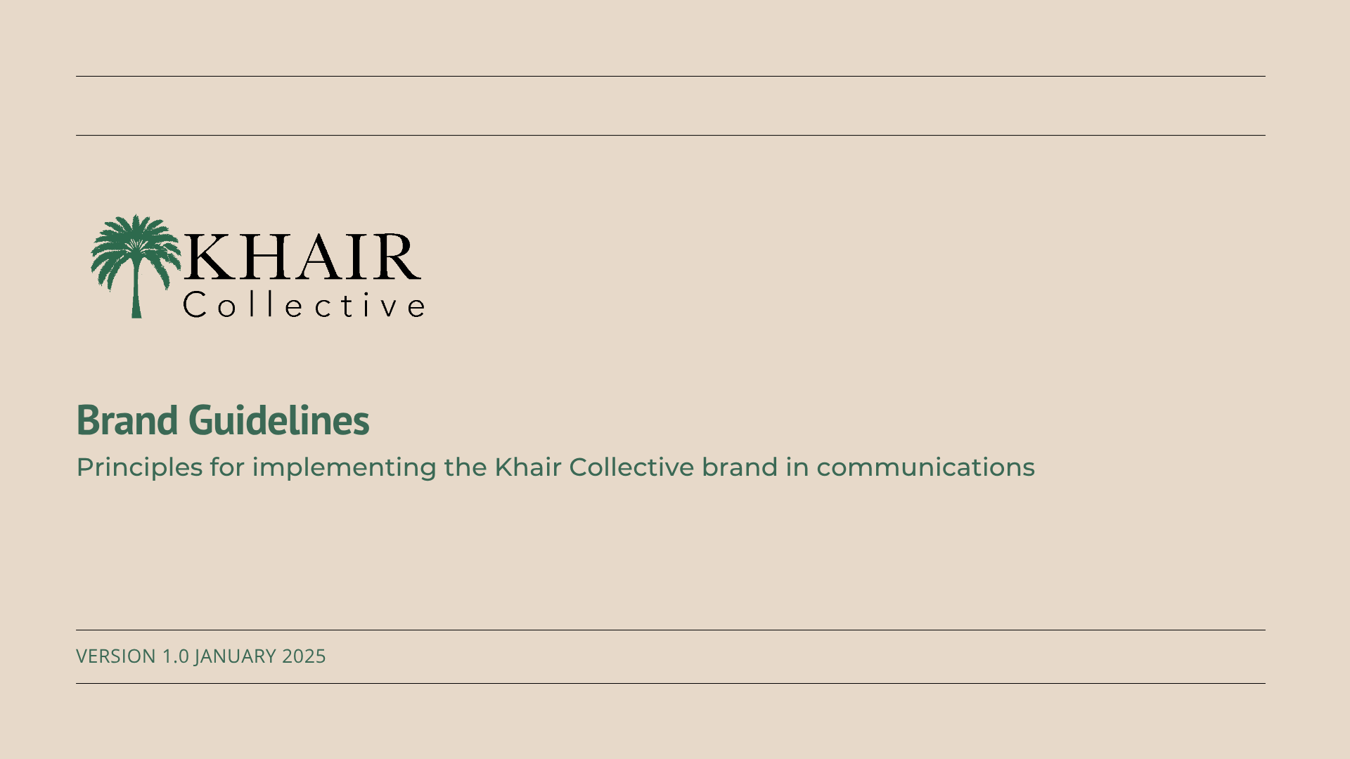
Lead the logo rebrand for Khair Collective, a community-driven organization dedicated to fostering positive change through impactful initiatives. The goal of the rebrand was to create a clean, professional, and simplistic identity while maintaining a meaningful connection to the organization's values.
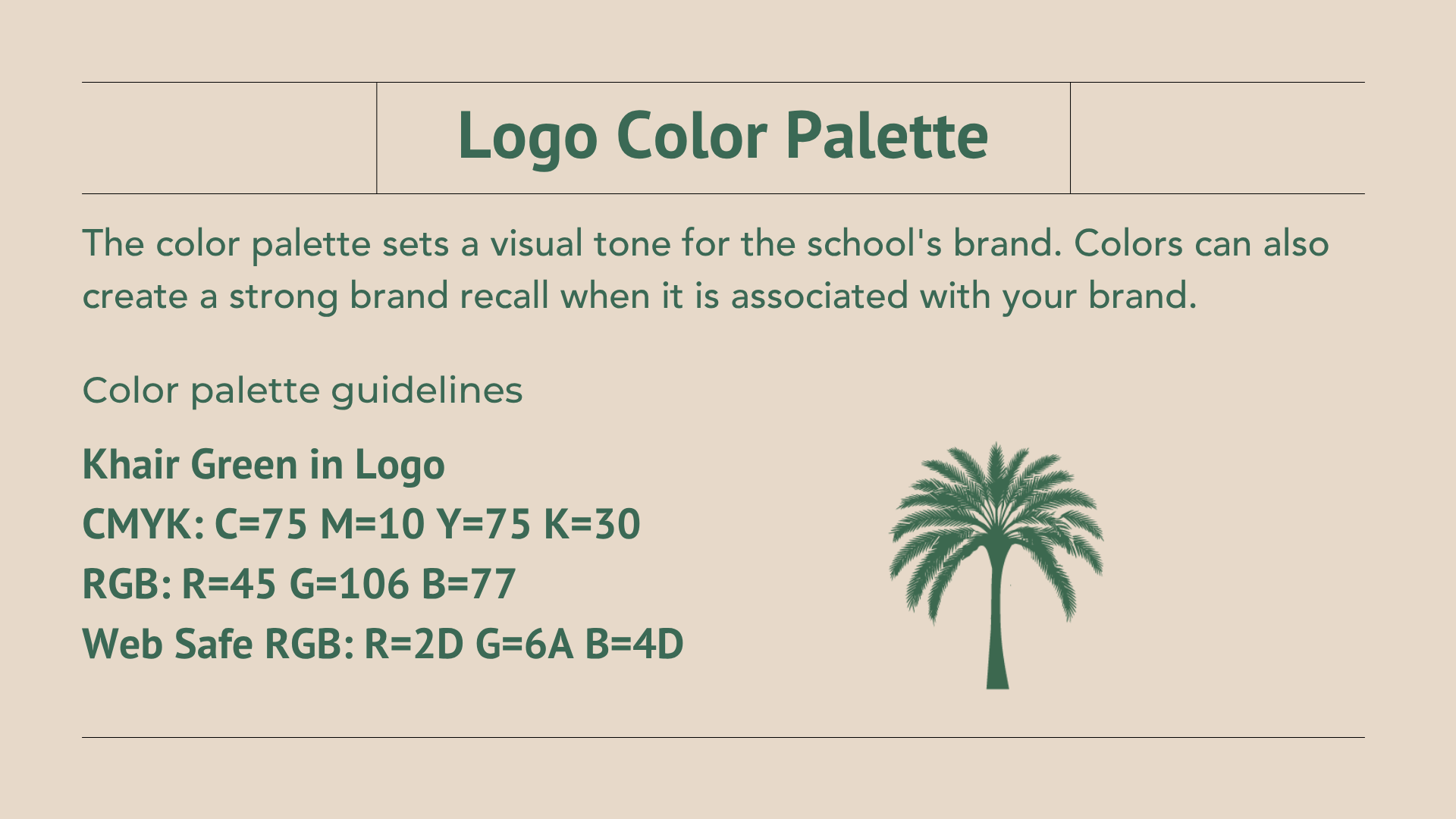
The redesigned logo incorporates the iconography of a date palm, inspired by the story of the weeping date palm, symbolizing that all living beings have feelings and deserve kindness. This thoughtful representation aligns with Khair Collective's mission of compassion and community service.
Research and Discovery
I began by understanding Khair Collective's mission, audience, and the unique role it plays in fostering compassion and community service. I explored the symbolism of the date palm to emphasize the value of kindness and interconnectedness, ensuring the design resonated with the organization's core message.
I began by understanding Khair Collective's mission, audience, and the unique role it plays in fostering compassion and community service. I explored the symbolism of the date palm to emphasize the value of kindness and interconnectedness, ensuring the design resonated with the organization's core message.
Concept Development
Using insights from the research, I created sketches and mood boards to explore different ways to incorporate the iconography of a date palm. These initial ideas focused on achieving a balance between simplicity and meaningful symbolism, ensuring the design aligned with modern, professional aesthetics.
Using insights from the research, I created sketches and mood boards to explore different ways to incorporate the iconography of a date palm. These initial ideas focused on achieving a balance between simplicity and meaningful symbolism, ensuring the design aligned with modern, professional aesthetics.
Design Execution
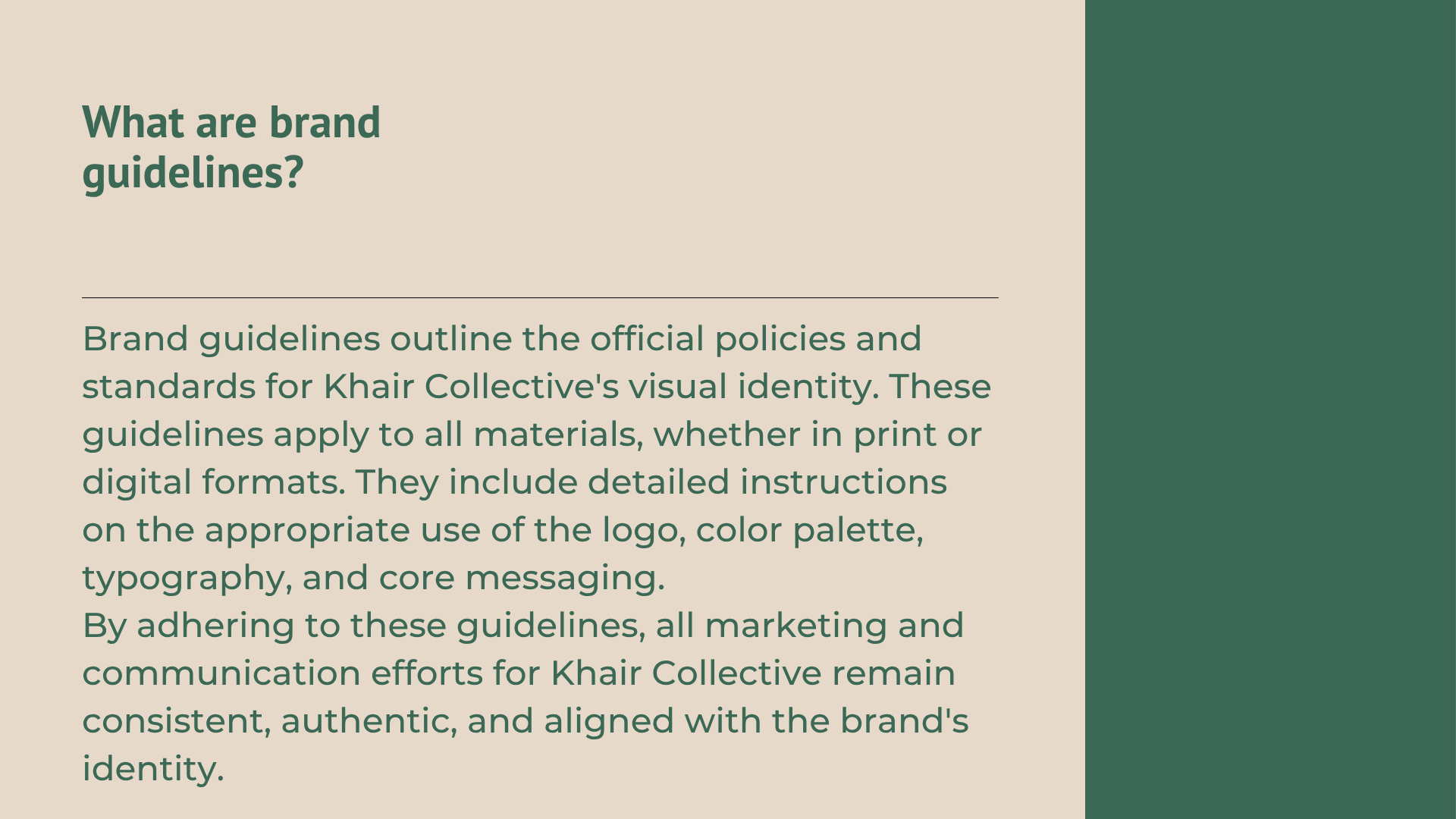
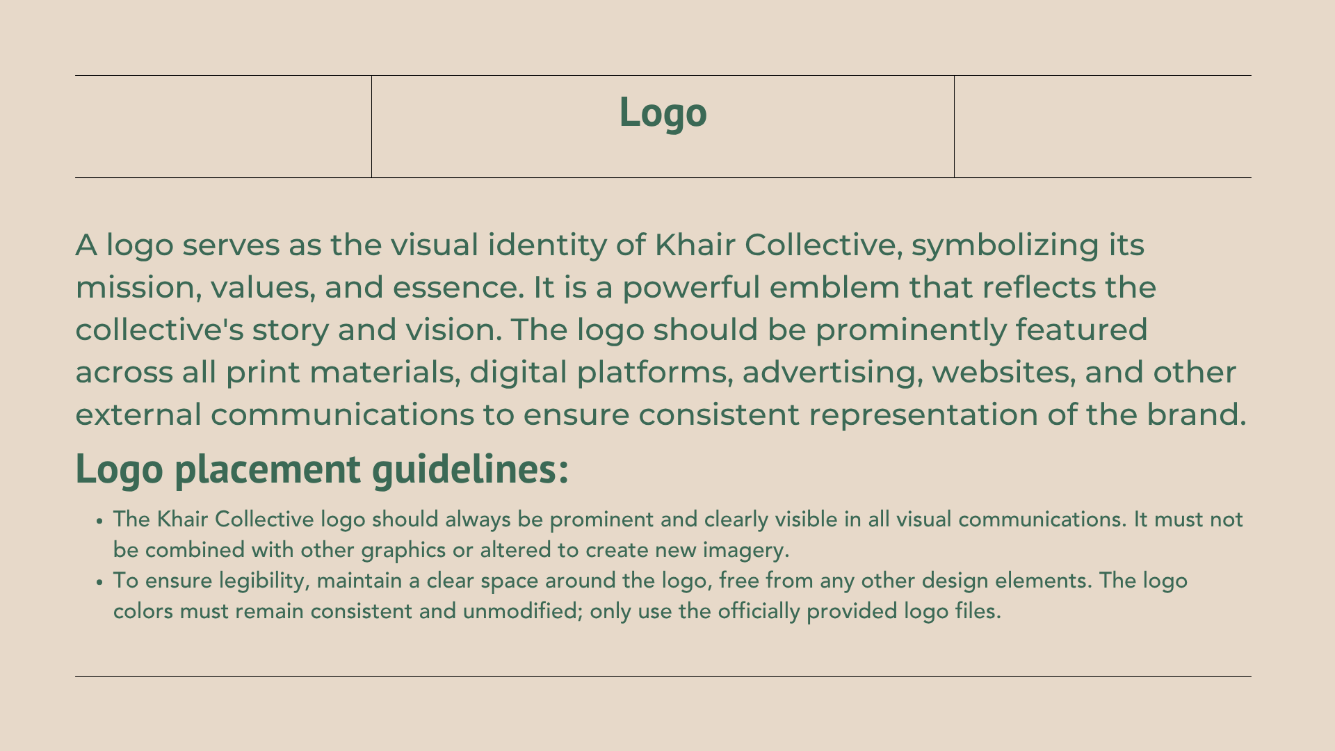
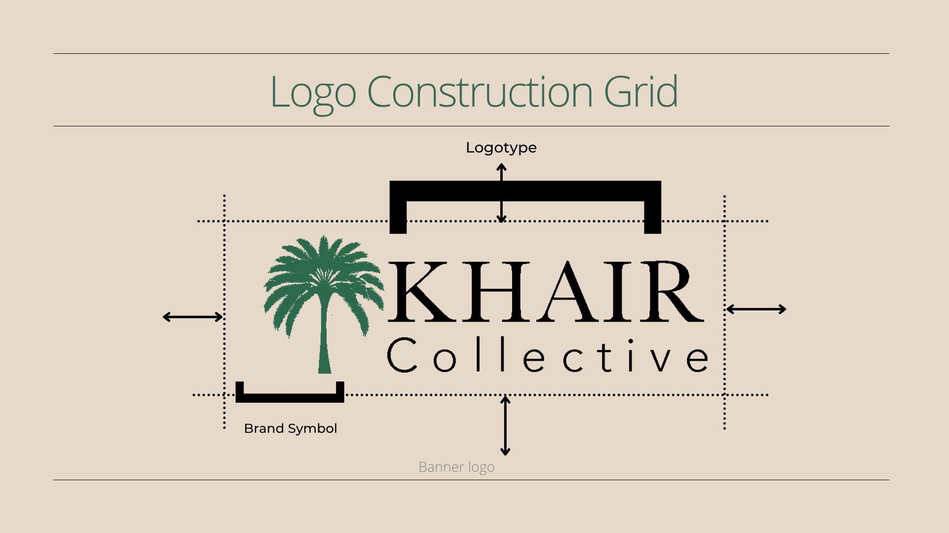
After developing key concepts, I refined the selected designs into polished visuals. I focused on clean lines, versatile elements, and timeless appeal while ensuring the logo would be adaptable across various platforms and materials.
After developing key concepts, I refined the selected designs into polished visuals. I focused on clean lines, versatile elements, and timeless appeal while ensuring the logo would be adaptable across various platforms and materials.
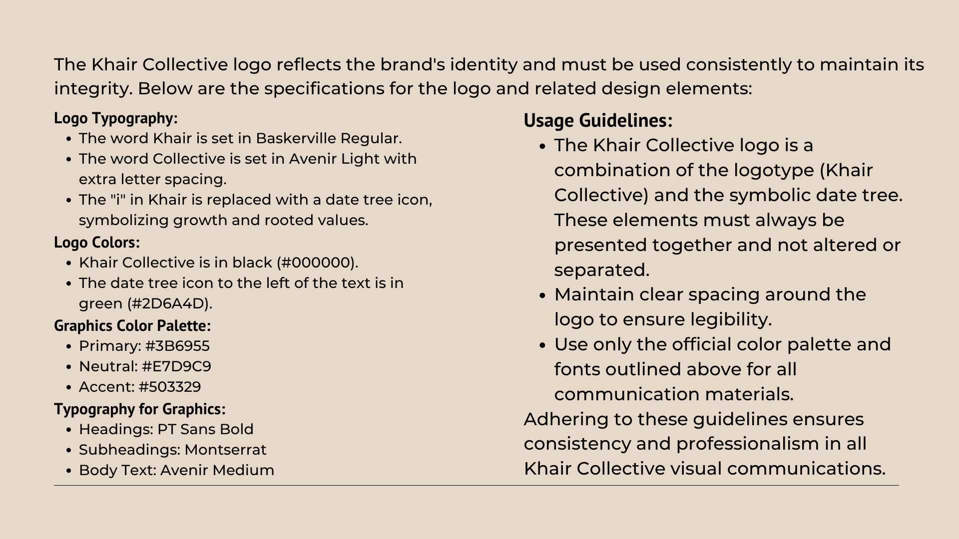
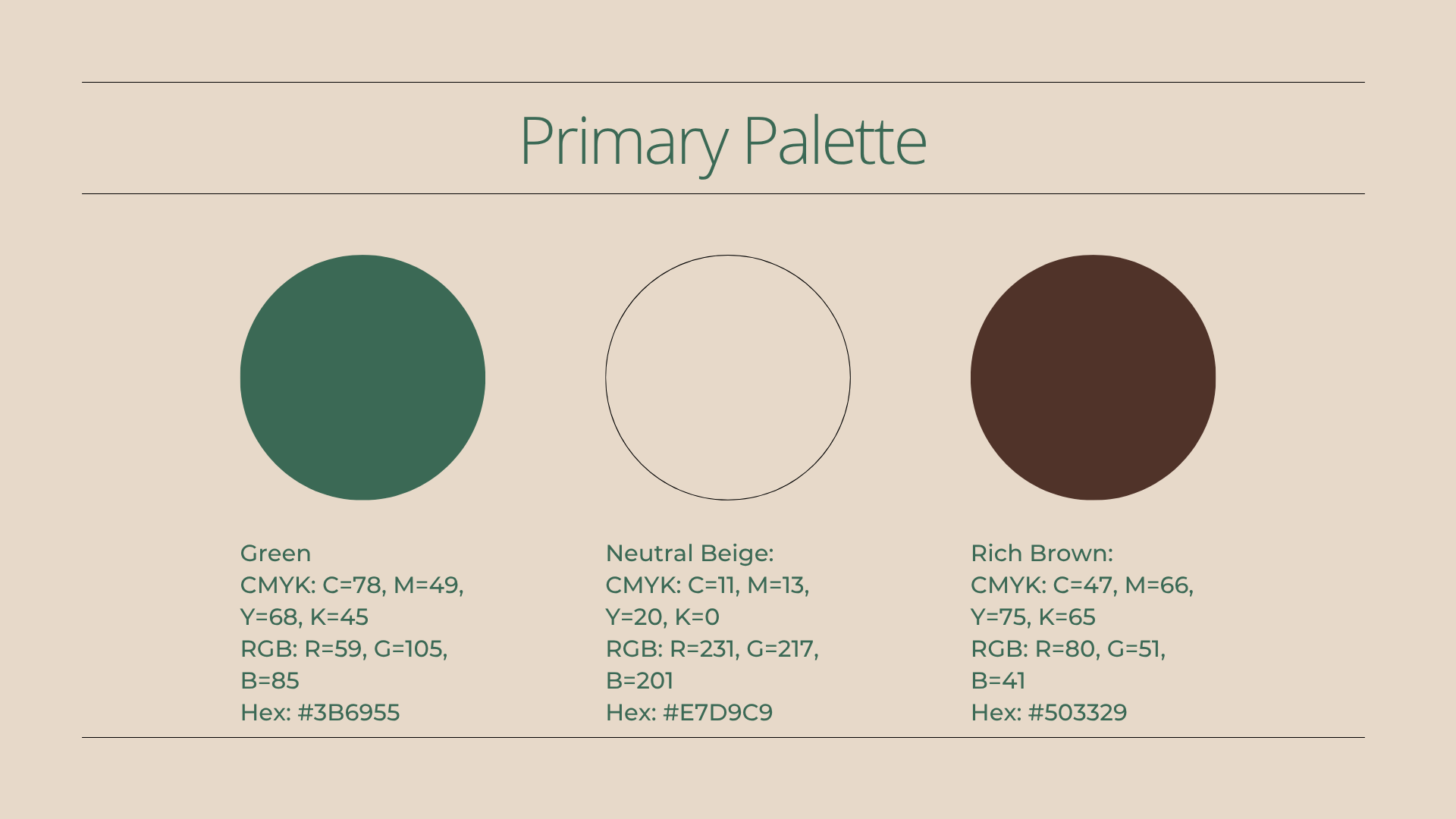
Through in-depth research and exploration, I crafted a logo that communicates Khair Collective’s core values while maintaining a modern and professional aesthetic. The iterative process ensured the final design was meaningful, visually appealing, and aligned with the organization’s identity.
Before
After
Social Media
Designed a social media flyer for a mental health workshop and produced a video using audio from the event, edited with ocean visuals and captions for accessibility
